I guess it’s time for my take on the second half the DC relaunch. While this set didn’t have the same number of standout books, I think the overall quality was about the same as the first 2 weeks.
All-Star Western. Writers Justin Gray and Jimmy Palmiotti. Art by Moritat.
Gray and Palmiotti have quietly put out some of the best work to come from DC Comics over the last five years. Among others (Power Girl, the underrated Freedom Fighters) their biggest success has been Jonah Hex. With the re-launch they stick with that character, but the focus of the series changes. Hex is now in Gotham City and part of a continuing story instead of a done-in-one. It works wonderfully. Hex is teamed with Gotham psychologist Amadeus Arkham (founder of the famous asylum) to solve a series of Jack the Ripper-esque murders. Jonah and the Doctor couldn’t be more different, but they are also both outsiders in Gotham City. The reveal of the truth of the situation at the end is perfectly horrifying.
While the writing team sets up a terrific western murder mystery, the art is the star of this book. Moritat’s clean lines somehow establish the grimy-ness of a burgeoning late 19th century city. He really succeeds at making Gotham as much of a character as Jonah Hex or Dr. Arkham. The great art combined with writing that is more than simply adequate but actually very good makes All-Star Western one of the best books of the month.
9/10
Aquaman. Writer Geoff Johns. Art by Ivan Reis & Joe Prado
Geoff Johns is the master at distilling a character to a simple, relatable idea. His take on Aquaman is compelling. He uses the real life perception of Aquaman, that he’s a lame, stupid superhero, to his advantage when setting up the hero. John’s Aquaman is hero in two worlds, neither of which appreciates him. He may be king of Atlantis, but due to his above water heritage, they see him as an outsider, while the population on the surface doesn’t believe in his undersea tales or ridicules him for them. Aquaman is clearly affected by his reputation, but he is not discouraged by it. He is a hero.
While Johns might lay it on a bit thick with the reputation stuff, the writing is mostly crisp. Interesting, though likely a bit gory new villains, some sort of anglerfish men, are introduced and Aquaman’s history and situations is deftly weaved into the story. Ivan Reis’s art is perfectly fitting and up to his usual high quality. The few flashback panels are especially good, though that is probably as much the colorist as anybody. Still, this issue is a fine first issue, a perfect establishment of who and what Aquaman is.
8/10
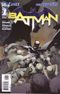
Batman. Writer Scott Snyder. Art by Greg Capullo & Jonathon Glapion.
Snyder, fresh off an excellent run on Detective Comics, writes a very good, not quite great, new Batman. There are many clever touches here, like a facial recognition contact lens and Dick Grayson masquerading as the Joker to help stop a riot in Arkham, but there isn’t much that’s not standard Batman stuff. A new rich rival, a new mysterious villain and requisite appearances but pretty much the whole supporting cast. It is perfect for someone who only knows Batman from the movies to jump on. I do love the return of Harvey Bullock and that Snyder wrote Commissioner Gordon as Columbo.
Capullo’s art is a big surprise, in a good way. I didn’t expect much, but I hadn’t actually had much experience with him. I shouldn’t have worried. His art has personality, it has character. Everyone is distinct and recognizable. It is just really nice. This is a very good book.
8/10
Batman: The Dark Knight. Writer/Co-Plotter Paul Jenkins. Artist/Co-Plotter David Finch.
Finch draws Batman extra brawny and everything very detailed. Aside from the faces, his art is solid. The writing and plotting, though, leave a lot to be desired. Bruce Wayne gives a speech at a fundraiser, and then tries to quell a riot at Arkham Asylum. This is standard Batman stuff. In fact, most of it happened in the much better Batman. There is tons of narration about the nature of fear that is overwrought and just plain bad. Overwrought pretty well describes the whole comic, art and writing. Except for the last page “shocker” that reveals the worst possible take on Two-Face, that is just stupid. Still, this isn’t an outright terrible comic, but there are definitely better Batman comics out right now, like Batman or Batman and Robin. This is slightly better than Detective Comics, but not a lot.
3/10
Blackhawks. Writer Mike Costa. Finishes by Ken Lashley. Layouts by Graham Nolan.
For a comic that I had no expectations about, this still manages to disappoint. Not that it is especially bad, but it could have and should have been much better. The idea here is basically a DC Universe G.I. Joe team. The characters, whose personalities are only hinted at in this issue, could develop into an interesting team. The problems crop up with some just stupid bits of plotting. Like a covert ops team painting their logo on their plane, then being in trouble when someone spots it. Why put it on there at all? The art is inconsistent, never actually good but it does veer into awful for a while. It looks rushed and sloppy. This is a bad first issue of a comic that could be very good.
3/10
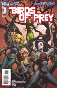
Birds of Prey. Writer Duane Swierczynski. Artist Jesus Saiz.
This has potential. Saiz’s art is clean and reasonably detailed that very effectively tells the story. The story is a bit of a muddle, like coming in on the third act of an action movie. The situation is broad enough that it is easy to get behind the heroes, despite accusations of murder and other crimes. But who their anatomists are isn’t really clear, nor is the connection between the characters or far that matter who our heroes are. I know Black Canary from previous comics, and this establishes her as a martial arts superhero, but the rest and all of Starling, the other lead, is a blank. This issue does set up a mystery that could and should be interesting, but it is clumsy. Not a bad start, but not the cleanest one.
6/10
Blue Beetle. Writer Tony Bedard. Art by Ig Guara and Roy Rose.
Some may complain about the retelling the origin of a character that has only been around for 5 years, but it is clear that the reason for doing it is to remove allusions to the crossover Infinite Crisis as well as to have a nice multimedia friendly origin. For the most part, this book works. The art is solid, though nothing to get excited over. The writing has some strange bits, like an editor’s note that says translated from Spanglish when it isn’t, but the story is a solid one. The only really troublesome change is that they turned the Reach, the villains who sent the scarab to Earth, from somewhat ambiguous assimilators to evil conquerors. Still, it is hard to escape the fact that if you’ve read the last series you’ve read a better version of this story. That doesn’t mean that this is a bad version, simply a mediocre one.
6/10
Captain Atom. Written by J.T. Krul. Art by Freddie Williams II.
This is a book where the art stars. Williams renders Captain Atom as a bright figure of reality on an almost impressionistic, dark background. In the end our protagonist, even though he is a completely unreal flying blue man seems more real than the world around him. It is really good, stunning work. The writing by J.T. Krul, who hasn’t written much that is good and plenty that is terrible, is also solid. There are certainly flaws — how did there get to be a volcano in New York? Is anyone even remotely intrigued by the cliffhanger? — but it is mostly solid superhero stuff. Captain Atom is not just a man losing his humanity but also a man whose self is actively deteriorated. It is an interesting hook.
7/10
Catwoman. Written by Judd Winick. Art by Guillem March.
From cover to cover, this book made me feel dirty, like some cheap cable soft-core porn. It is literally impossible to separate the plot of the book from all the T&A because it pervades all parts of this comic. While a trashy romance take on Catwoman is not an inherently bad idea, here it is not done with much skill or class. Winick does nothing to make Catwoman in interesting character. All we learn of her from this issue is that she uses her sexuality to solve her problems, even when it doesn’t make sense for any reason other than the artist wants to draw some boobs. March has a unique style to his art and while his work here isn’t terrible, it absolutely exacerbates the voyeuristic felling the whole comic has. I really, really did not care for this.
3/10
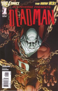
DCU Presents: Deadman. Written by Paul Jenkins. Art by Bernard Chang.
Another competent but unremarkable comic. Chang provides nice, clean art. Nothing to get excited about, but also nothing to complain about. The story is an effective explanation of who Deadman is that quickly and intelligently remakes his origin. He is no longer searching for his killer, but trying to balance some sort of Karmic scales because in life he was a douche. It is a good hook for a hero, but one that can never end because when it does, Deadman dies. Strangely, Deadman is a getting a big push in the new DC Universe, with a spot on a Justice League team, a supporting role in another book and a 5 (or 6) issue story in what is supposed to be an anthology title. I think wasn’t a good idea to start this title with such a long story about a character, but it doesn’t seem to be a bad story.
6/10
The Fury of Firestorm. Written by Gail Simone and Ethan Van Scriver. Art by Yildiray Cinar.
This is a complete re-imagining of the Firestorm concept. Now Ronnie Raymond and Jason Rusch are high school students that through the use of some sort of SUPER SCIENCE capsule become Firestorm. It opens with a disturbingly violent set of murders, something that continues to happen throughout the book. Then we get to our heroes. Simone and Van Scriver set up our heroes as complete opposites with about as much subtlety as a hammer. But the hammer is a tool they clearly know how to use, so it doesn’t come off too bad. The art never rises above middling, with some rough pages of Ronnie playing football offsetting the nice pages after they become Firestorms. The concept seems good, much better than the mess that the characters were in in the previous continuity. My only substantial complaint is the level of violence that this book treats so casually. The Fury of Firestorm isn’t great, but it certainly is interesting.
7/10
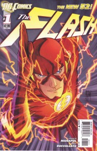
The Flash. Story and Art by Francis Manapul and Brian Buccellato.
I had some trepidation with artists taking over writing duties on this title, but luckily, my fears were unfounded. Maybe it’s just because it is currently fresher in my mind than Batwoman, but I’m calling this the best-looking book coming out of DC. This is a nearly perfect melding of story and art. There are several pages that are just jaw droopingly awesome. The story itself is nothing special, though it sadly has a somewhat uncommon tone. This is a traditional superhero book. It is about the Flash solving a crime. There is little blood and only one possible death. It is refreshingly straightforward and heroic. We actually get to see the protagonist hang out with some supporting cast. While I would guess Barry’s reunion with Iris West is inevitable, I like Patty Spivot. While she appeared some in the previous Flash series, this one issue made me like her. And Iris comes off as a wonderfully pushy Lois Lane type. Even the previously personality free Barry Allen is interesting. If the creative team can maintain this level of artistry and keep the story moving this could be the best book of re-launch.
9/10
Green Lantern Corps. Written by Peter Tomasi. Art by Fernando Pasarin.
I have to admit that I was inclined to like this book before I read it. Tomasi’s previous Green Lantern Corps run was a favorite of mine, and I have an unhealthy affection for Guy Gardner. While trying to be as unbiased as possibly, I still think this is a really good comic book. It effectively establishes the two heroes, Guy and John Stewart, showing their problems fitting in on Earth now that they are superhero space cops. Then they pop back into space just in time to investigate some something that is killing Green Lantern. This book isn’t great and it isn’t flashy, but it works. The art is the best sort of realism that manages to make the crazy aliens look just as real as the actual people do. Plus, I crack up every time I see that panel of Guy almost crying when they tell him he can’t coach football.
8/10
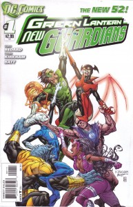
Green Lantern: The New Guardians. Written by Tony Bedard. Art by Tyler Kirkham.
Tony Bedard has an interesting story he’s setting up here, but he doesn’t do a very good job of it in this first issue. There is a pointless retelling of Kyle‘s, the fourth Green Lantern, origin that glosses over why the guardians would give the ring to him. The rest of the issue isn’t particularly bad, but underwhelming. The art does it no favors. Kirkham’s art is like a watered down Jim Lee, only now with anime hair. The whole style is dull and off-putting. The art and writing together add up to a kind of bad comic book that at least has the promise of a decent hook.
4/10
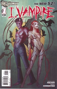
I, Vampire. Written by Joshua Hale Fialkov. Art by Andrea Sorrentino.
The cover does this book no favors, but inside it is pretty decent. A vampire guy and his vampire lover debate whether they should try to take over a world that is filled with superhero’s that will absolutely kill them. Then on starts a war on humanity and the other tries to stop it. Some of the dialogue is over the top ridiculous, but for the most part, it works. The art fits the mood of the book perfectly, with everything being dark and foggy. It does make it hard to differentiate some characters, but it looks really good. I’m not sure how far this book can go when the end point is already known. There is no way these vampires have a chance against Superman and the rest of the superheroes. I do appreciate the bait and switch of the Twilight looking cover and inside real, murderous vampires.
7/10
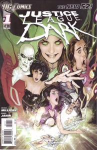
Justice League Dark. Written by Peter Milligan. Art by Mikel Janin.
While the title is dumb, this is a good concept, a Justice League team set up to deal entirely with magical threats. This first issue illustrates both how the Johns/Lee Justice League could have introduced all the characters in the first issue and why it didn’t. The whole of the eventual team appears in this book, but assuming you don’t have any previous knowledge of them this book does little to clue you in. And most of these characters aren’t even close to household names. Sure, John Constantine had a movie and Zatanna has been in a lot of DC cartoons, but the rest are mostly unknowns outside of rapid comic book fandom. Still, the book gets all the players on the board and tells a reasonably coherent story. Plus, Mikel Janin’s art is really, really good. It does look a little stiff and posed occasionally, but with the excellent coloring, the art on Justice League Dark definitely helps set the creepy tone of the book. This is by no means a perfect book, but it is one with potential.
7/10
Legion of Superheroes. Written by Paul Levitz. Art by Francis Portela.
As I said with Legion Lost, the Legion of Superheroes has a reputation for being impenetrable. And in this re-launch that has held true. This is a book more dependant on what came before than any other book that DC published this month. Unfortunately, it does almost nothing to let the reader know what that was. It’s not that the story is particularly hard to follow, it is just that this isn’t chapter 1, it is more like chapter 12. It is easy enough to follow the plot, but there are relationships that drive the story that are only hinted at. Portela’s art is fine, aside from the occasional wonky face, but as a new start, this issue is a mess. I can’t imagine this gaining the Legion any fans, but I assume it won’t lose them any either.
4/10
Nightwing. Written by Kyle Higgins. Art by Eddy Barrows.
Dick Grayson returns to his old identity, and it is like he never left. I really enjoyed this. It shows where Dick has been and where he is now while hinting at where he is trying to go. This feels like a continuation of the old Nightwing series, and that is a very good thing. His long running series (nearly 15 years) was often very good superheroics that actually benefited from starring Batman that wasn’t Batman, as that freed it up to tell stories with a greater feeling of danger. Kyle Higgins seems to write in the mold of Chuck Dixon, and while that rarely produces great comics, it usually produces very good ones. Eddy Barrows art is mostly good, giving Dick a great sense of motion and an acrobatic style. This is an upper end good book.
7/10
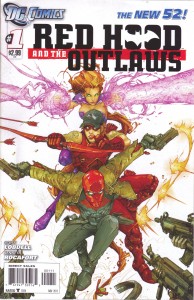
Red Hood and The Outlaws. Written by Scott Lobdell. Art by Kenneth Rocafort.
I am going to give Lobdell a pass on Starfire in this issue. As she is written it is damn close to vile, but I am willing to believe that it is not intentional, that there is an explanation. Fiction is predicated on things not being what they seem. I hope that is the case here. Other than that, this is a decent trashy buddy comic. The Red Hood and Arsenal are both losers, but together they make a decent team. Rocafort’s funky page layouts and oddly chiseled looking characters are strangely compelling to me. And the colorist Blond really nails it. I want to see more of this art. But for that, this book needs to be better. Lobdell hit Superboy out of the park; I hope he can right this ship. There is trashy fun to be had here, if there is a decent explanation for Starfire.
5/10
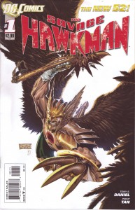
Savage Hawkman. Written by Tony Daniel. Art by Philip Tan.
This is a hard issue to judge. It isn’t good, but I’m not sure it is terrible. Tan’s art is very good on some pages but confusing and sloppy on others. The new set up is interesting, but this issue doesn’t tell us much about Hawkman. Daniel describing him as an alien Indiana Jones sounds great, but that doesn’t really come across in this issue. The dialogue is the best I’ve seen from Daniel, but honestly, that is almost an insult. Much of the premise is still vague or unclear and the villain is the most uninteresting sort of rage murder monster. I could see this developing into a pretty good action comic, but after one issue it is a mess.
4/10
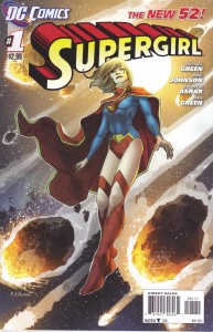
Supergirl. Written by Michael Green and Mike Johnson. Art by Mahmud Asrar.
If this comic had been a little meatier, I would be lauding it as one of the great successes of the relaunch, up there with The Flash and Aquaman. Unfortunately, it is a little light. Asrar’s art is clean and crisp, avoiding the blatantly sexual posing that pervades cape comics while simultaneously making Supergirl seem like a confused, scared girl and a powerhouse. The story is an intelligent take on the way Jeph Loeb portrayed Supergirl only a few years ago. Her unfamiliarity with humanity emphasizes Superman’s Earthly upbringing. She is clearly lost. But there just isn’t much to this issue aside from Supergirl crashing to Earth and waking up. She then fights some guys in mechs, which looks nice but doesn’t really accomplish anything. Not a bad start, but a slow one.
7/10
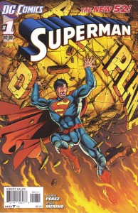
Superman. Written by George Perez. Art by George Perez and Jesus Merino.
This is one dense comic. Perez packs 25 pages with more word balloons and narration boxes than any other 3 comics. That in and of itself is neither good nor bad, it all comes down to the merit of all those words. For the first half of the comic it is pretty good. A touched cramped, there is a lot of information being thrown at the reader trying to set up Superman’s new status quo, but nice a meaty in comparison to something like Supergirl. Then there is the second half, where Superman’s fight with a fire monster is obscured by both the T.V. coverage and Clark’s own newspaper story. The newspaper take on the fight is really unnecessary and is easily the comics biggest fault. It is both badly written and redundant with the visuals and the T.V. take, which is actually integral to the story. The art is hard to fault. Perez is a legendary artist and Merino manages to smooth over some of the excess detail. This is a comic that needs to breathe; it needs to pack less information in the space provided. Its density makes it ponderous. Still, it is not a terrible start for the new Superman.
6/10
Teen Titans. Written by Scott Lobdell. Art by Brett Booth and Norm Raphmund.
Teen Titans is much better than I expected. The writing is reasonably crisp, and the plot is much more upbeat and fun than the solicitations made it seem. While all the characters are rebooted, although for Red Robin I think it is just his Teen Titans past that is gone, but none seem to have been greatly damaged by the change. They seem young and reckless, which is probably how they should feel. Booth’s art is not quite the albatross around the neck of this book that I though it would be. It still isn’t very good, his style makes everything looks elongated and weird, but it isn’t as early Image terrible as some of his stuff looks. This is a reasonably decent comic. Not great by any means, and with Booth’s art not good as far as I’m concerned, but not terrible.
5/10
Wonder Woman. Written by Brian Azzarello. Art by Cliff Chiang.
Chiang is the king of drawing. This book is up there with The Flash and Batwoman as the best looking of the re-launch. If only for the art this is one of the better books of the month. Fortunately, Azzarello also sets up a nice story. His Diana is powerful, but not cold. There are the seeds of a great dynamic between her and Zola, the woman she is protecting from the anger of at least one of the Gods. The modernized version of the Greek Pantheon in this book are visually more interesting than they have been, but it seems a little tired after reading Incredible Hercules. Wonder Woman is set up as the intercessor between men and gods, having to protect a pregnant woman from the capricious immortals. I am a sucker for modern mythology stories, and this is among the best I have read.
9/10
Voodoo. Written by Ron Marz. Art by Sami Basri.
I was kind of dreading reading this, but I ended up liking it a lot. Like Supergirl, it is sparse, especially on details about its title character, but this comic sets up its mystery better than most of the mystery-ish books of the re-launch. It is impossible to ignore that this book is set mostly in a strip club. While there is a flimsy story pretext for this, it mostly seems to be there because the Wildstorm Voodoo was also a stripper. The combination of Basri’s clean art and Marz matter of fact treatment of the subject help this book to not feel exploitative. Still, this is 20 pages of the worst secret agent ever and his partner watching a stripper that they believe is a shape-changing alien. They have a theory about her, and part of it is confirmed. This issue leaves it up in the air if its protagonist is a monster or not and it actually feels like a mystery worth pursuing.
7/10


 The rest of the game has been fun. Easy but enjoyable nonetheless. Despite not having actual dungeons, Elebits plays like a Zelda game. That is a huge compliment. The biggest difference is that instead of finding new tools and magical items, the player finds Omega Elebits. These Omegas function identically to Zelda’s tools, with each one having a unique puzzle-solving ability. The Fire Omega, for instance, can spew fire clearing away path-blocking brush and the Ice Omega can create ice platform to let the player cross rivers. To further add to the Pokemon-ness is the fact that the player can evolve most of the Omegas, provided you feed them enough charge, that is.

