Its now three-ish weeks into the DC Relaunch and I guess its time for my take on the books released so far. I have read them all, and so far I’d call the relaunch a success. I’m going to give my take on all 27 of the books released so far with a brief review and a score from 1-10, going in alphabetical order because why not?
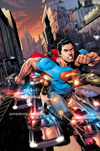
 Action Comics. Grant Morrison and Rags Morales.
The best book of the relaunch so far. Morrison gives us a significantly younger, less powerful Superman, as well as one who is more proactive. This issue moves at a frantic, frenetic pace, never really stopping to let the reader catch their breath. It is heavy on action but still manages to seed tons and tons of Superman stories to come. Most amazing is the fact that nearly throughout it all Superman is smiling. He may have a touch of Batman in his methods, but he isn’t dark and brooding. Just a great, great issue.
10/10
 Animal Man. Jeff Lemire and Travel Foreman.
Another truly great book. Lemire lays the ground work for an excellent horror tinged superhero family comic. Foreman’s sparse artwork complements it perfectly, especially in the terrifying dream sequence near the end. The only flaw, if there is one, is that it is pretty dense. Lemire uses an excerpt from a fake magazine interview to explain who Animal Man is that is as clumsy as it is effective. This is shaping up to be something different than the usual superhero fare and an excellent read.
9/10
 Batgirl. Gail Simone and Ardian Syaf.
Gail Simone writes Barbara Gordon’s return to Batgirl, and walking, and it is something of a disappointment. This is not a strictly bad comic, but it is somewhat overwrought, especially that last page, and too focused on what came before. There is a tepid new villain and a potentially interesting roommate and some generic superhero action. Ardian Syaf’s art is adequate, at times very good but not consistently. Simone does occasionally tend to miss with her stories (though for every bad one there are 4 good ones) and I expect this comic to improve as it goes.
6/10
 Batman and Robin. Peter Tomasi and Pat Gleason.
Pat Gleason’s art is wonderful. It is detailed and elastic and a touch gruesome. I think he might be better suited for a book with monsters, like his previous work on Green Lantern Corps or something like Frankenstein or Demon Knights, but it is always very good. Tomasi lays it on a bit thick, perhaps, but subtly is not always a virtue. This is a book that new readers should be able to pick up and quickly grasp the relationships between the characters. It is little more than a simple Batman story, but it is a very executed one.
7/10
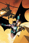
 Batwing. Judd Winick and Ben Oliver.
This is a basically new character and this first issue gives the reader no reason to care about him. Winick actually tells the us very little about Batwing and introduces a ridiculous (in a bad way) villain named Massacre. The story is just unappealing and unexceptional. Oliver’s art has great figure work, but it is severely lacking in background detail. This is a problem and the books main selling point is that it is Batman in Africa, but there is little in the art to cue the reader in to the exotic locale. This is simply not a very good book.
4/10
 Batwoman. J.H. Williams III and W. Haden Blackman.
This is the best looking book of the reboot. Williams art is fantastic, with inventive page layouts and stunning attention to detail. He changes the look of the book completely depending on whether Kate is being Batwoman or not. The story is also very good. It might read a little too much like the continuing adventures of Batwoman for some new readers, but since there is really only one previous Batwoman story and it is excellent this is no big deal. It does establish who Kate Kane and her friends are. Just another great book.
9/10
 Deathstroke. Kyle Higgins and Joe Bennet.
This sure is a Deathstroke comic. Higgins effectively, save for some over-the-top early captions, establishes who Deathstroke is and what problem he faces. Bennet’s art is clean and effective. It is a violent comic, but that is a feature, not a bug. It is not to everyone’s taste, it is not to my taste, but it works as what it is. A comic about hired killer trying to prove he isn’t over the hill could be decent, but it is not really something I want to read. It does fill its niche with quite well, though.
6/10
 Demon Knights. Paul Cornell and Diogenes Neves.
Another good book. Cornell is setting up a swords and sorcery magnificent seven and it is highly entertaining. The cast quickly shows themselves, though there is barely time to establish the scene. Neves’ art occasionally looks sloppy, but there are some great facial expressions and some awesome dino-dragons. This issue is not quite as slum dunk as the concept, but it has the story moving forward and promises great things to come.
7/10
 Detective Comics. Tony Daniel.
This is a bog standard, grim and gritty Batman comic. Tony Daniel tries to write like Frank Miller, not a bad goal, but doesn’t pull it off. His art looks really good for the most part, though. The problem is that this is mostly just a Batman versus Joker story, something that even people who don’t read comics have seen a thousand times, and a not particularly good one. It ends with a gruesome surprise, but it doesn’t feel like something that will stick. This is a bad issue.
3/10
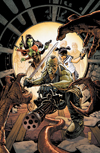
 Frankenstein, Agent of S.H.A.D.E. Jeff Lemire and Alberto Ponticelli
Here Lemire sets up a science action team made of monsters lead by Frankenstein. He throws idea after idea on the page in the perfect Kirby fashion. This is an efficient and effective introduction. We meet the team, same as the Flashpoint mini-series plus a mummy, and get right down to the monster killing. Ponticelli’s art is scratchy and wobbly and a perfect look for the book. Big on action and on craziness, this is exactly the kind of book I like to read.
8/10
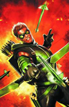
 Green Arrow. J.T. Krul and Dan Jurgens.
This is a dull issue. Green Arrow has been nearly entirely rebooted. He is now much younger and more James Bond than Robin Hood. To go with this new look Green Arrow, we have art that is decidedly old fashioned. Jurgens work is not bad, but it looks like a book from the early to mid 80’s. An odd fit for a new take on an old character. The story is not bad, it is a simple superhero story. It is nice to have some of those, but this is not particularly interesting. Though I doubt Green Arrow fans will be happy with this new take, maybe the emerald archer will find some new life with this not uninteresting set-up.
5/10
 Green Lantern. Geoff Johns and Doug Mahnke.
This might as well be Green Lantern issue 68, since nothing changes from before. Just like at the end of the War of the Green Lanterns crossover, Hal Jordan has lost his ring and Sinestro has returned to the Green Lantern Corps. Two thirds of the issue is inept mess Hal on Earth, realizing that without his ring he is a horrible screw up and the other third is Sinestro’s adventures in space. Mahnke’s art is amazing, as always. He makes the unreal aliens that make up much of the cast look as real as the people. This is not a fresh new take, but it is still really good. Johns’ Green Lantern work has faltered occasionally, but this is a return to from.
8/10
 Grifter. Nathan Edmonson and Cafu.
Instead of writing a good mystery in this issue, Edmonson wrote a dull one confusingly. It is not a complex story, but it is told in a way to make it hard to understand, all disjointed and out of order. The art is simply adequate. There is just not a lot to recommend here. It could develop into something interesting, a man fighting monsters only he can see, but this first issue is a mess.
4/10
 Hawk and Dove. Sterling Gates and Rob Liefeld.
I don’t have the somewhat comical, hateful reaction that most of the internet seems to have to Rob Liefeld’s art, but neither do I like it that much. It is not so much stylized as sloppy. With him on it, I don’t think I was ever going to like this book. It doesn’t help that it was written to deliberately play to Liefeld’s strengths and not, it seems, to tell a good story. It is also odd that Hawk and Dove seem to have come through the relaunch completely unchanged, despite not being a particularly fresh concept. This is probably a treat for Liefeld fans, but it is mostly a mess.
2/10
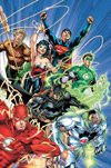
 Justice League. Geoff Johns and Jim Lee.
The only problem with this comic is outrageous expectations, a problem DC brought on itself. Unlike nearly every other book, Justice League is an origin story. It is going show how the Justice League came to be. It might have been more effective to show the whole league in action, but I don’t see any reason to complain about the book being something it is not. Lee’s art is the same genre defining art it has been for 20 years, and Johns plays this issue a little more slowly than usual. Probably a bit too slowly. Batman and Green Lantern are the only members in most of the book, and their interactions ring true. GL is reckless and overconfident and Batman is more than a little dismissive, though he seems to see the advantage of the powers GL possess. This is not an outstanding issue, but it is a good one.
7/10
 Justice League International. Dan Jurgens and Aaron Lopresti.
Jurgens’ writing is a bit ham-fisted, with some clumsy team building pages and some nonsense about protesters outside the Hall of Justice, but the plotting is mostly tight. It sets up a varied cast for a U.N. controlled team that might not be under control for long. Lopresti is a terrific artist, and the book is bright, colorful and expressive. Maybe it is my attachment to these characters, but I am inclined to like this book.
7/10
 Legion Lost. Fabian Nicieza and Pete Woods.
Legion Lost indeed. The Legion of Superheroes, DC’s super teens from the future, has a reputation for being impenetrable. Whether that is generally true or not, it is true for this issue. It is hectic and poorly explained and downright confusing. Pete Woods are is nice, but looks unfinished on some pages. There is the seed of a good series here, with heroes from the future being stuck in the past, but it needs to slow down and breathe.
4/10
 Men of War. Ivan Brandon and Tom Derenick. Jonathan Vankin and Paul Winslade.
This issue introduces the reader to the new Sgt. Rock, grandson of the old Sgt. Rock. The concept her is solid, soldiers dealing with the wake of superheroes. The execution is also solid if not particularly great. This book simply lack oomph. This first issue doesn’t really take advantage of either its war book setting or its superhero connection. It just sort of is.
5/10
 Mr .Terrific. Eric Wallace and Gianluca Gugliotta.
This is an intriguing but sloppy first issue. I am fond of Gugliotta’s art, but some panels and figures just seem off. The plotting is good, with a nice balance of action and world building, but the dailogue is sloppy. I am going to give Wallace the benefit of the doubt that this was supposed to have a snarky tone, but that is not effectively communicated. Everyone in the book seems like an asshole. If it finds a consistent tone this could be a really good book. This issue was simply okay.
6/10
 O.M.A.C. Dan Didio and Keith Giffen.
This is simply wall to wall action. Office drone Kevin Kho is turned into a monster but the mysterious Brother Eye then tears his way through Cadmus Labs until he finds and destroys what he is looking for. It is a Kirby homage that throws as many of the Kings DC ideas into the book as possible. Giffen’s art captures Kirby’s energy. It is pure fun for 20 pages. There isn’t much that isn’t fighting some kind of crazy science creation, but there doesn’t need to be.
7/10

Red Lanterns. Peter Milligan and Ed Benes.
If the whole issue was like the opening I would have rated this issue much higher. The absurd and gleeful violence in this book is entertaining. Milligan plays it so close to satire but doesn’t quite go over that line. It is definitely self aware, but not mocking the concept. Benes provides his usual trashy but competent art, which looks much better when there are blood vomiting cats on the page than absurdly sexualized aliens. If it didn’t end with overwrought Earth violence and a backstory explaining soliloquy from Atrocitus this could have been a really good issue.
5/10
 Resurrection Man. Danny Abnet and Andy Lanning and Fernando Dagnino.
This book seems perfectly crafted to not appeal to me. The art isn’t necessarily bad, but it is dark and scratchy I just find it off-putting. The main characters power is interesting, that he dies and comes back to life with a new power, but we don’t learn much about him besides that. The fact that he is wanted by both the forces of Heaven and Hell is not a plus, that doesn’t interest me in the slightest. This whole issue is dull and faux edgy.
4/10
 Static Shock. John Rozum and Scott McDaniel.
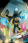
This is an effective attempt to horn in on Marvel’s Spider-Man market. Rozum and McDaniel do a good job of mixing superheroics and family time while still communicating who Static is. The villain team isn’t anything that interesting, but whatever. The art is stylized and fit’s the story and character. My only problem is that I don’t particularly care for Spider-Man, let alone knock-off electic Spider-Man.
7/10

Stormwatch. Paul Cornell and Miguel Sepulveda.
I expected better from Cornell. Sepulveda’s art looks rushed and sloppy, but it al least has a nice style. The writing, though, does little but clumsily introduce the cast. It is a good concept, though it doesn’t seem to be the same as the Wildstorm version was, though they share many characters. I know by issue 3 they are going to be fighting the moon, but this first issue is just clumsy.
6/10
 Suicide Squad. Adam Glass and Federico Dallocchio.
No book got a more negative pre-realease reaction than Suicide Squad. Between the ill-advised character redesigns to the interviews with the writer that suggest a complete misunderstanding of the characters and concept, it seemed like this book would be a stinker. And it is. The art is inconsistent at best and the story is ugly and nasty and poor. There is nothing to recommend here.
2/10
 Superboy. Scott Lobdell and R.B. Silva.
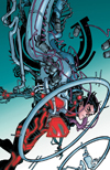
Superboy is another character who got a complete reboot. He, however, seems to be coming back exactly as he was when he first arrived. This issue is dense. It may be only 20 pages, but it covers much more ground than most of the other titles. Superboy is a lab experiment, with no morals because he has had no experiences. It is as much about the N.O.W.H.E.R.E. lab that he was made in than Superboy himself. Silva’s art is clean and expressive; it looks really nice. The only problem I can see is that it seems to tie in to Teen Titans, which looks terrible.
8/10
 Swamp Thing. Scott Snyder and Yanick Paquette.
Scott Snyder’s first book of the relaunch is something of a disappointment. Not that it isn’t good, it is, but because I was expecting great, which it wasn’t. There just isn’t much here. Too much time is spent trying to reconcile and recap Swamp Things history and not enough time is spent on the actual story. The story that is started and teased is intriguing, but it is unfortunate that in a comic titled Swamp Thing, Swamp Thing doesn’t appear until the last page. Paquette’s art is really good, though. This is a good start, but not a great one.
8/10
There are my thoughts on the first half of DC’s New 52. Most of the books I was really looking forward to have already come out, but there are still several good looking ones on the horizon. Wonder Woman looks great, as do Batman and Aquaman. While I have no idea what the writing will be like, I can say for sure that The Flash will be a good looking book, possibly challenging Batwoman for the best art of the relaunch. See ya later, space cowboys.





 At first I thought I just needed to learn the methods, the syntax, of the genre to enjoy it. Listening to the terrific episode of Retronauts about adventure games led me to believe this was likely the case. So I fought through games like Syberia, Beneath a Steel Sky and Lure of the Temptress. While I found the stories enjoyable for the most part, I thought the solving arcane and baffling.


